2020
Il Felice Gelato di Milano
Tags
Art Direction
Branding
Illustration
Packaging
Photography
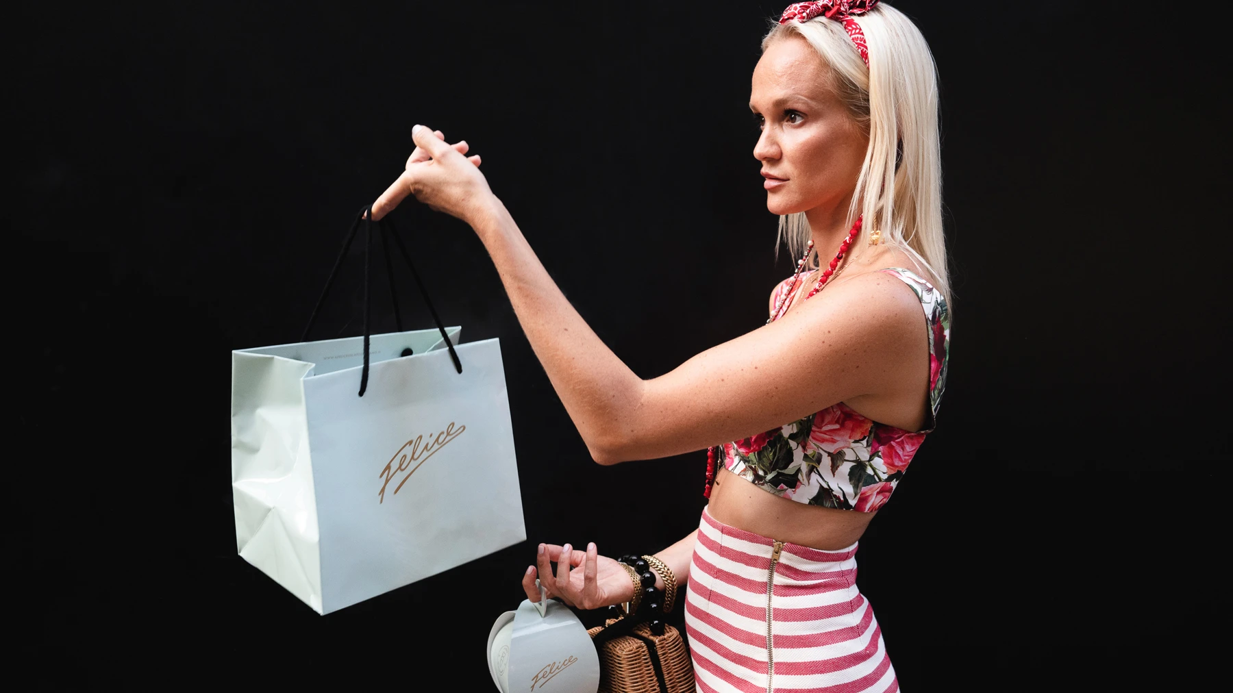
Approached by the ice cream shop Felice I was asked to create their visual identity, packaging and other related in-shop / communication materials. Starting from the hand-written signature logo I created a brand identity and concept around the shop that would help them stand out, attract and grow into one of Milan's top "gelaterie".
Overview
Identity
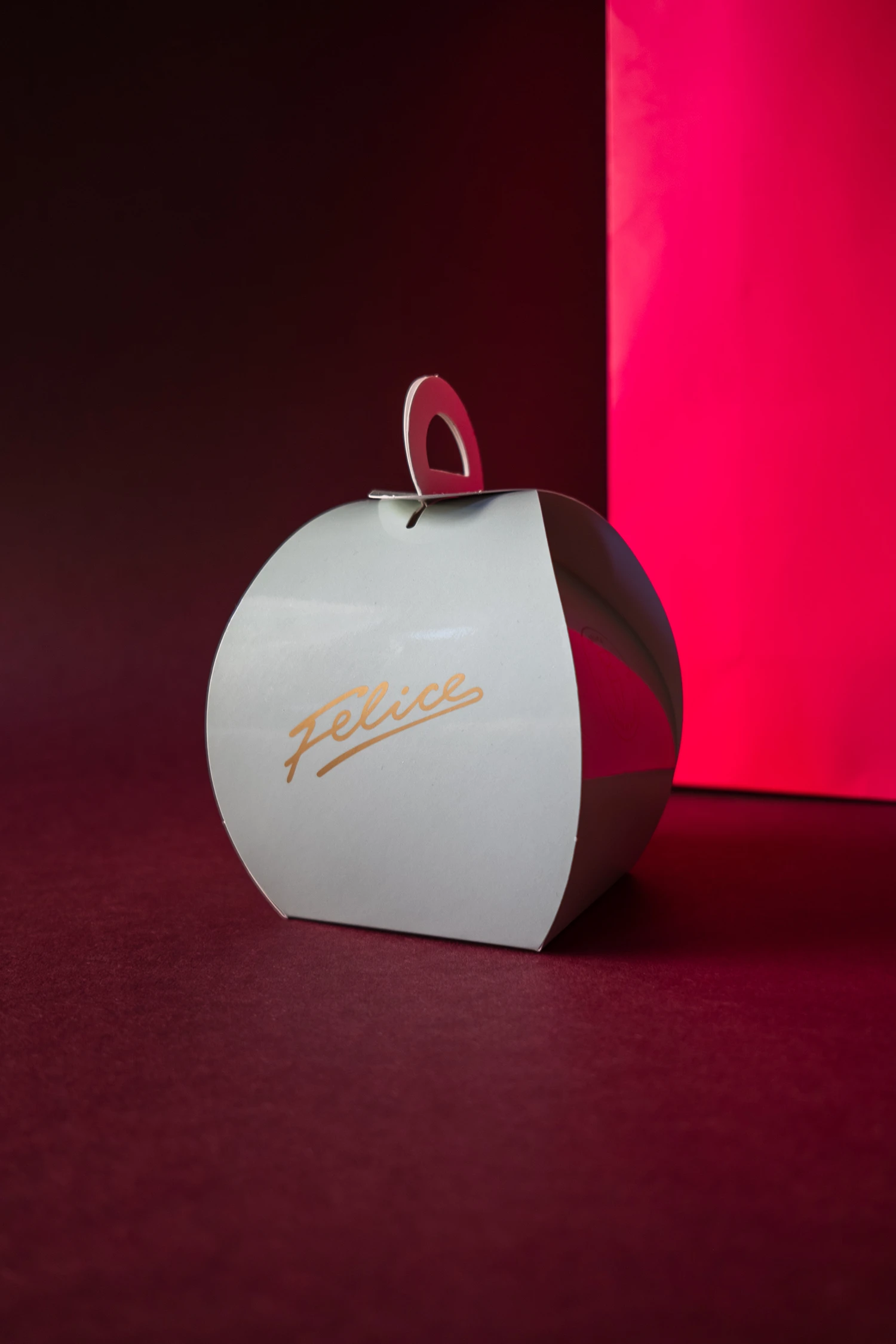
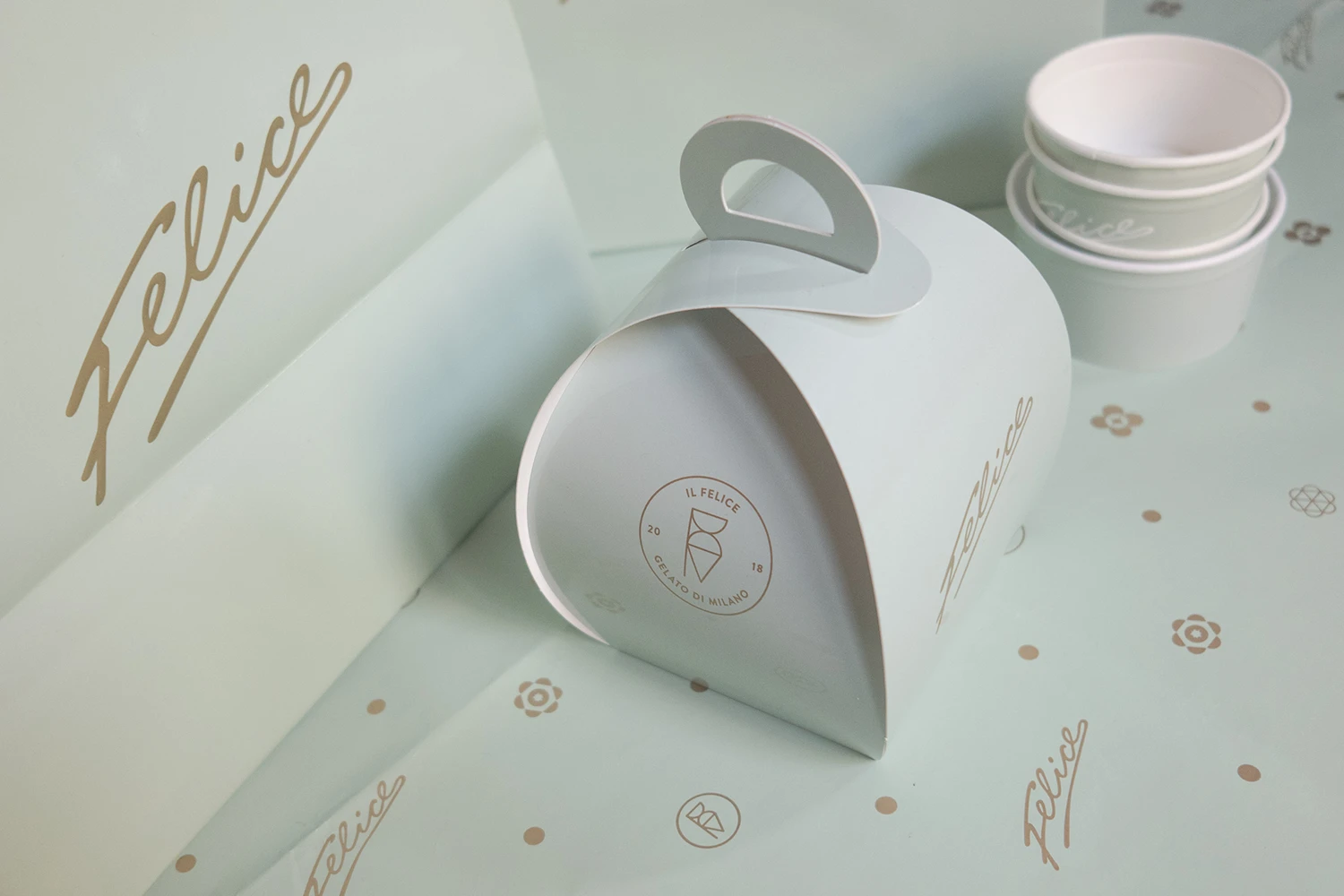
The simple yet elegantly playful identity and packaging of Felice is driven by the hand-drawn signature logo that decorates everything from napkins to packaging and the shops signs made in neon lights. The main inspirations of the identity is a mix of contemporary and vintage culture referencing the playful and optimistic graphics that could be seen in Italy's 1950s art and advertising for brands like Campari and Vespa. The color palette is inspired by flowers and ice cream flavors including a soft pastel green, lavender violet, dusty pink and a pale summer lemon contrasted with a muted gold giving it a classic and elegant look.
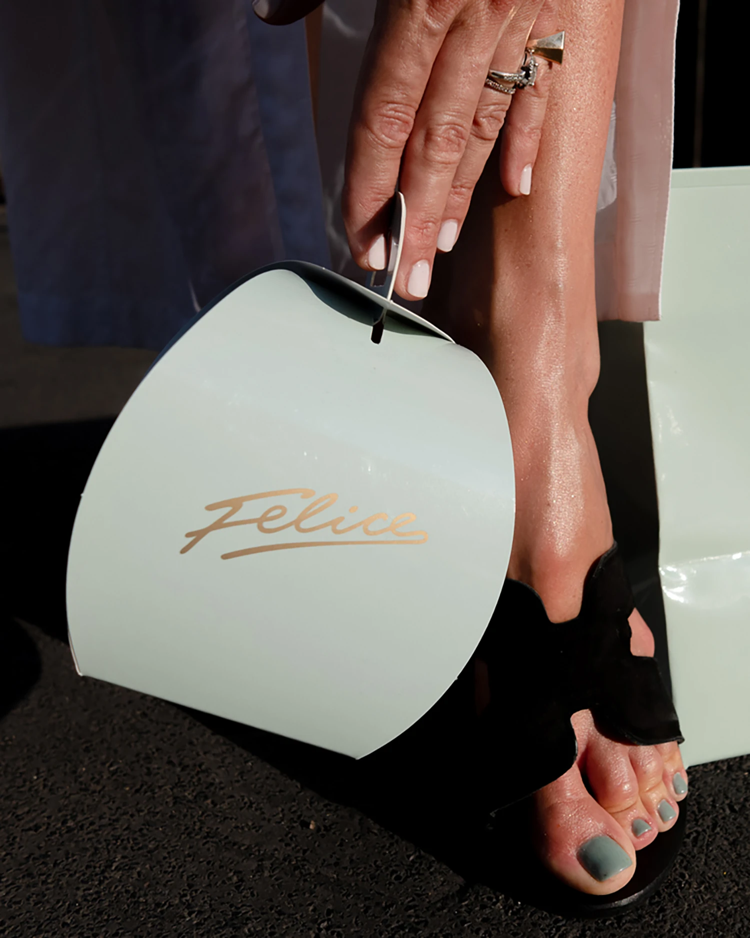
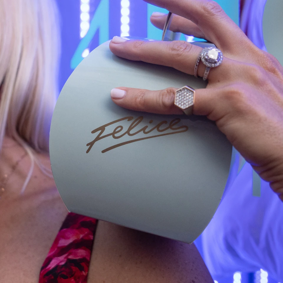
The packaging was printed locally using eco-friendly paper-stocks. The logo is set in a muted gold metallic Pantone that was then embossed on the bags giving it a premium and tactile feel reflecting the brands high quality products and attention to detail. The aim was to create something that both looked great and wouldn't get thrown away instantly, but could be reused by their customers thus helping the environment and giving the shop additional visibility at the same time.
Website Layouts
The website layout and clean structure help highlight products and photography giving it an editorial look and feel.
Photography
Food Photography
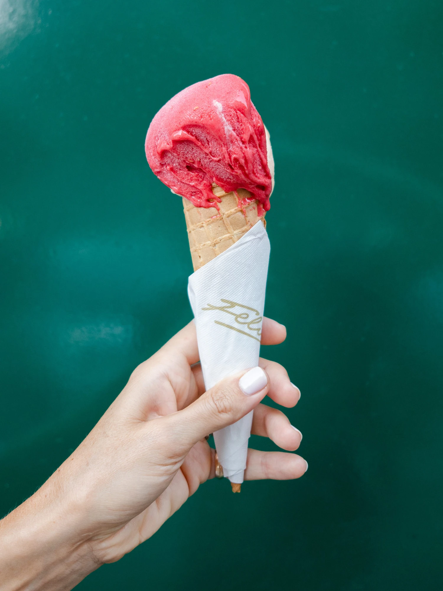
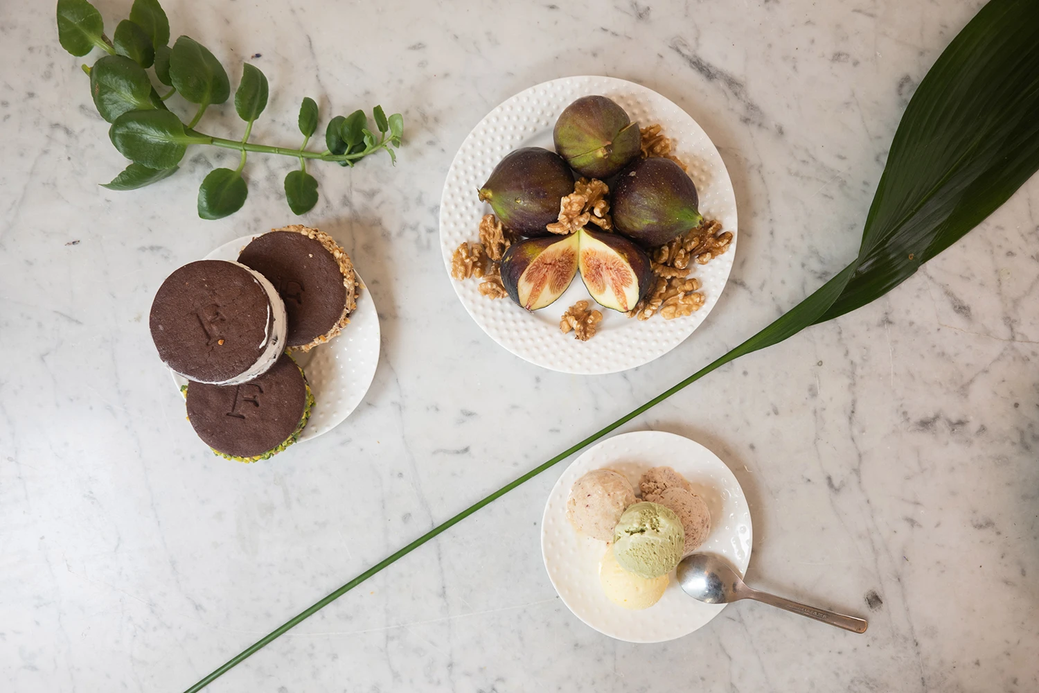
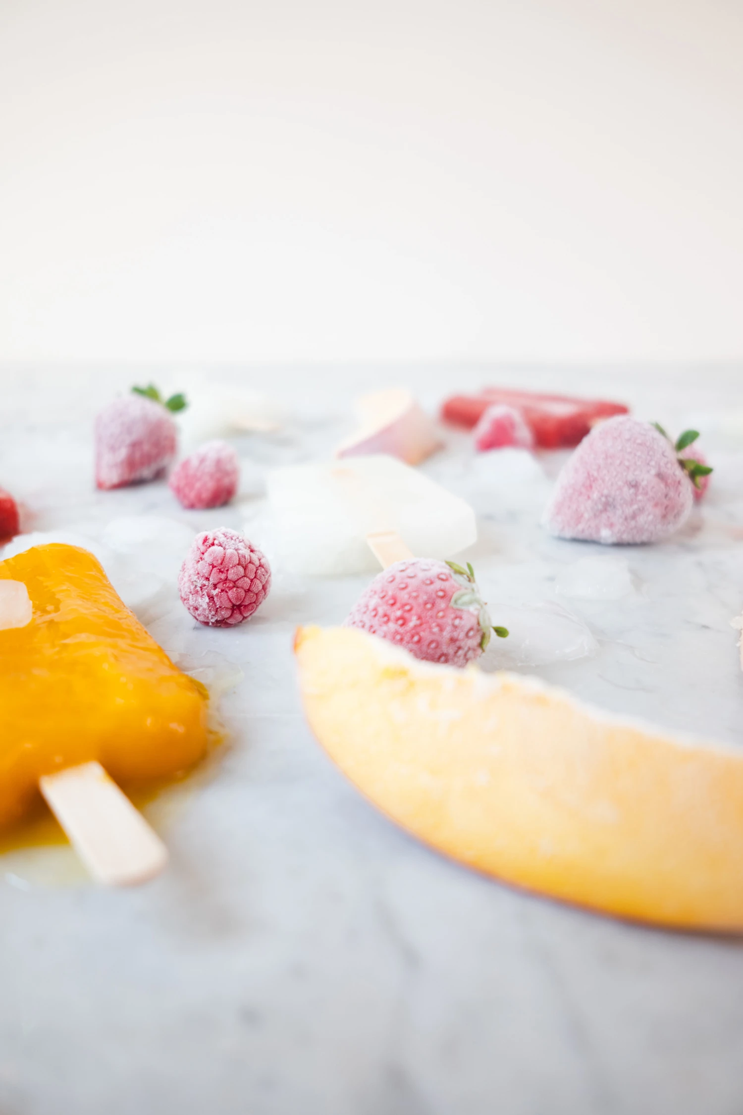
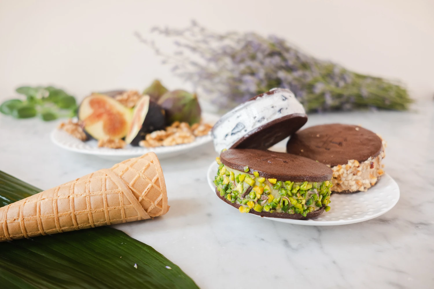
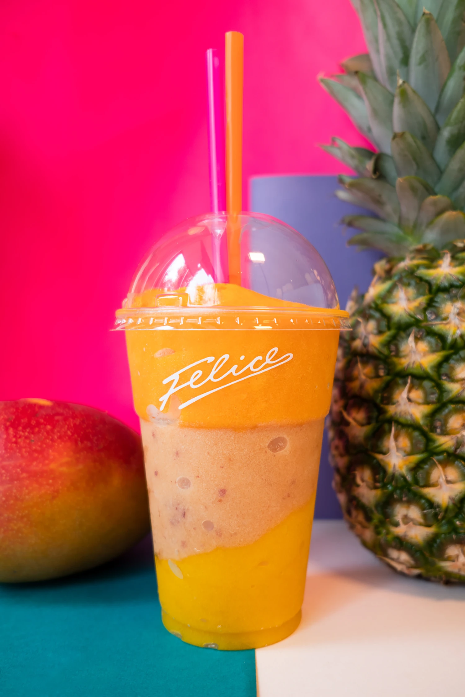
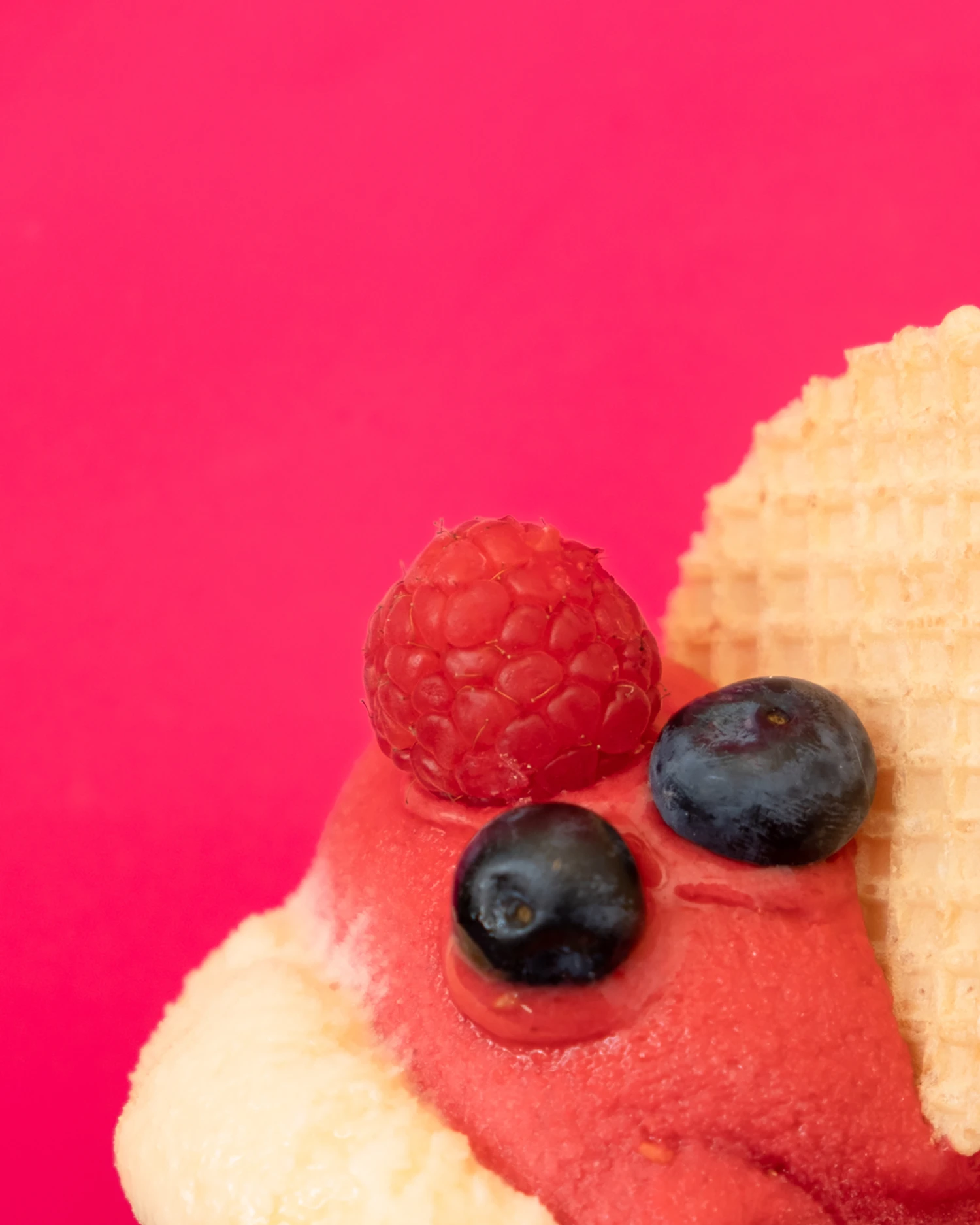
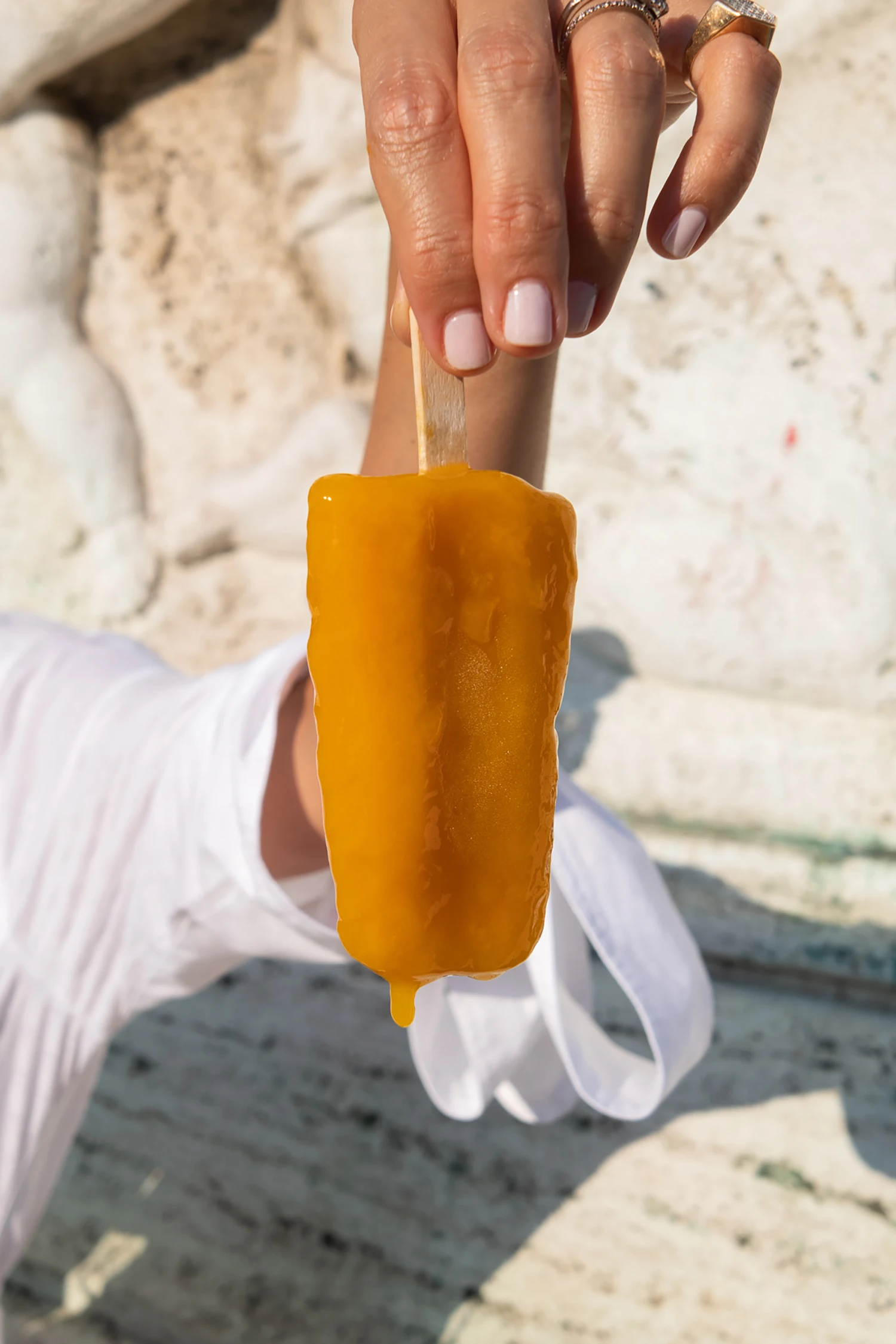
These photos where shot inside the shop using daylight to create a soft, fresh and a natural look.
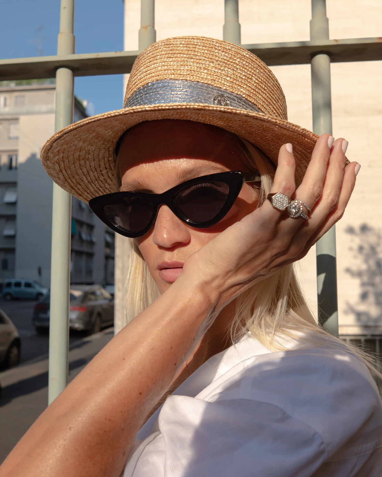
Editorial Photography
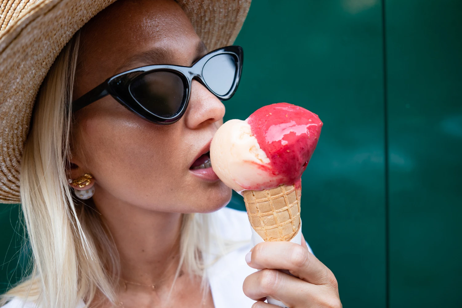
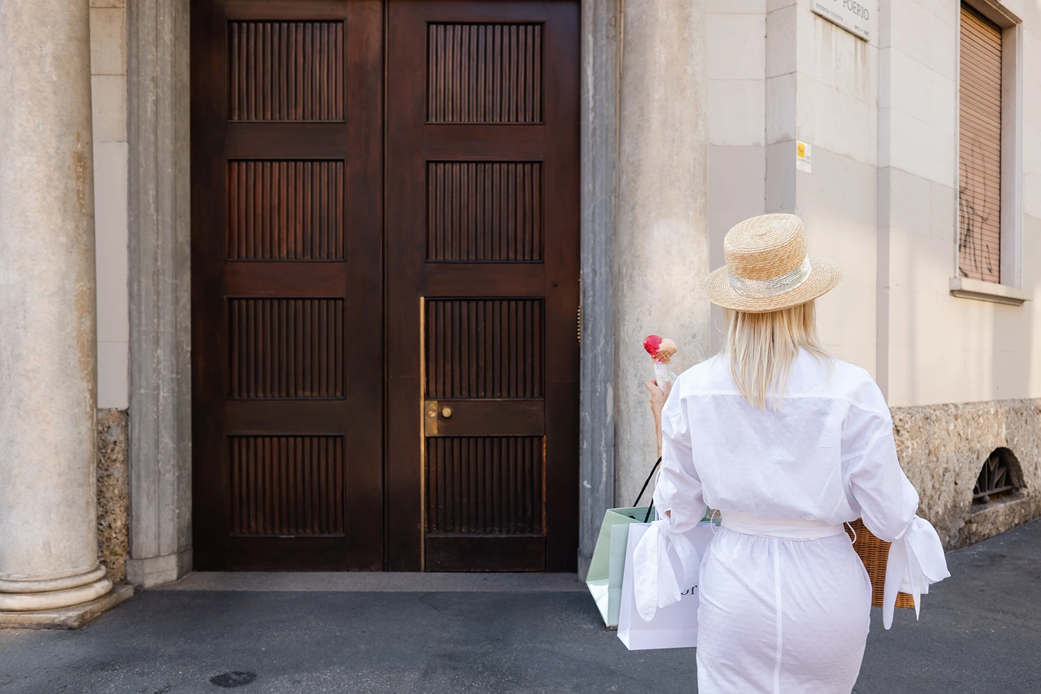
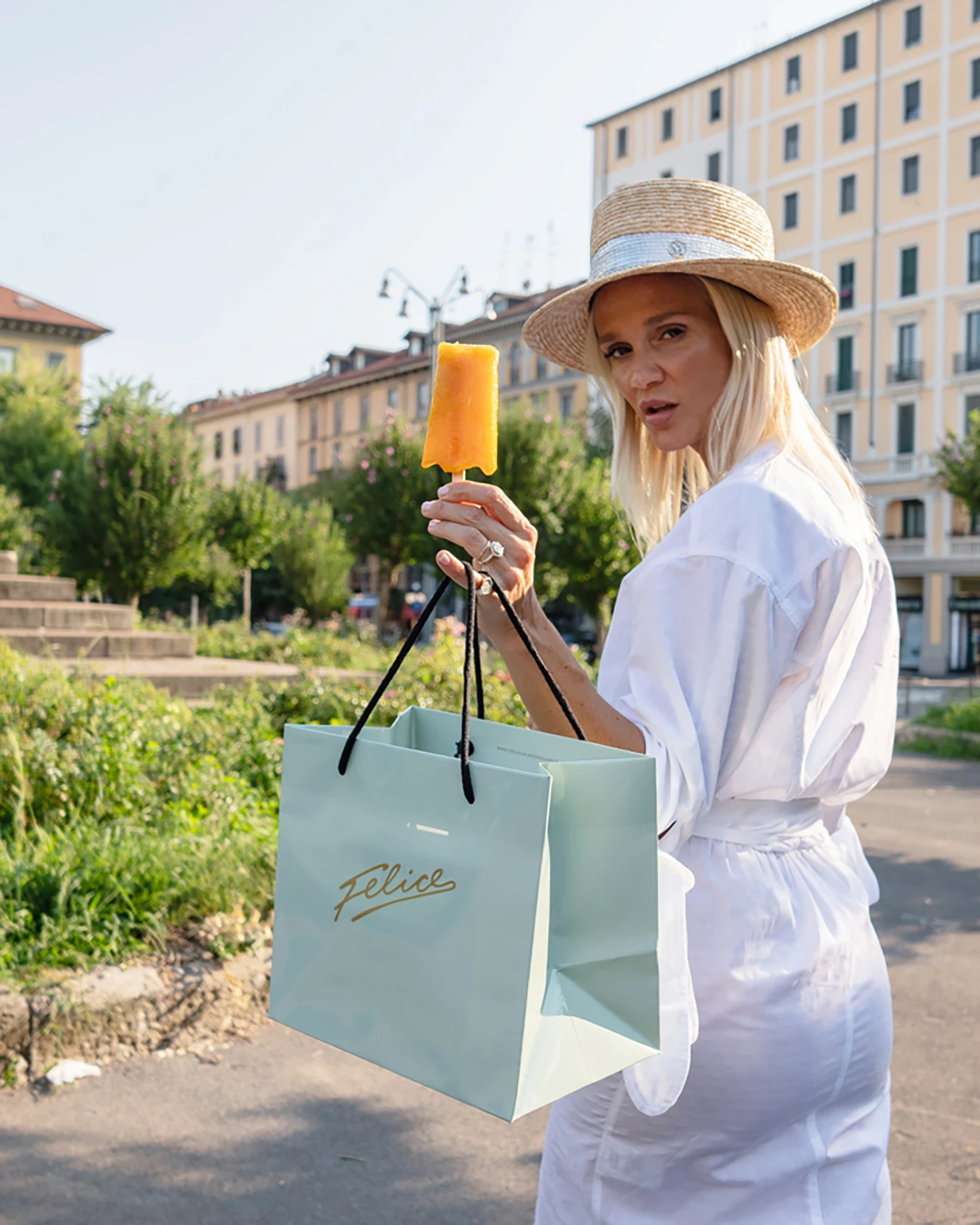
I followed along with my camera on the hot summer streets of Milan as Beverley moved graciously through the city around the shop in Piazza Risorgimento – finishing off with an afternoon aperitivo in the fashionable street of via Montenapoleone.
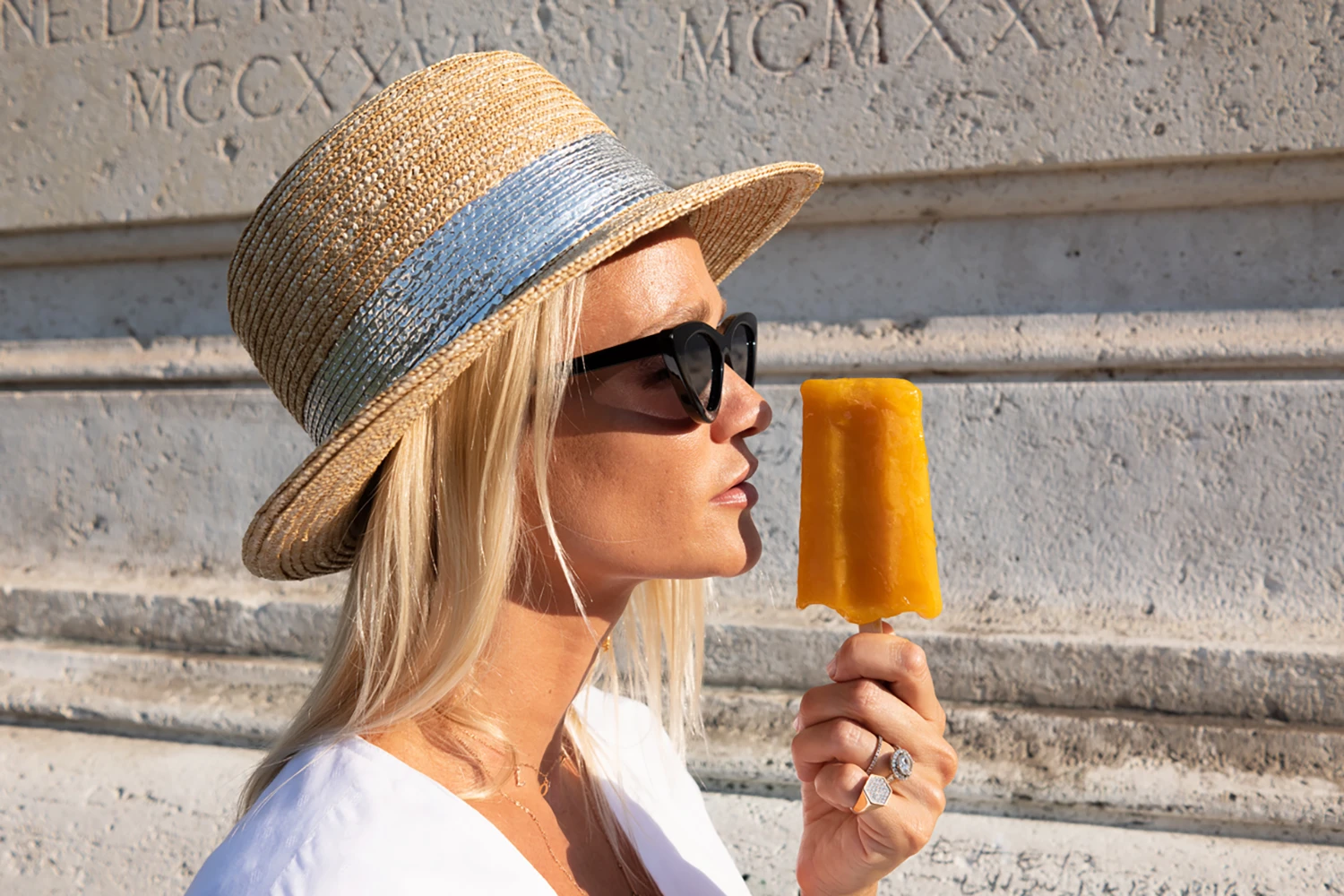
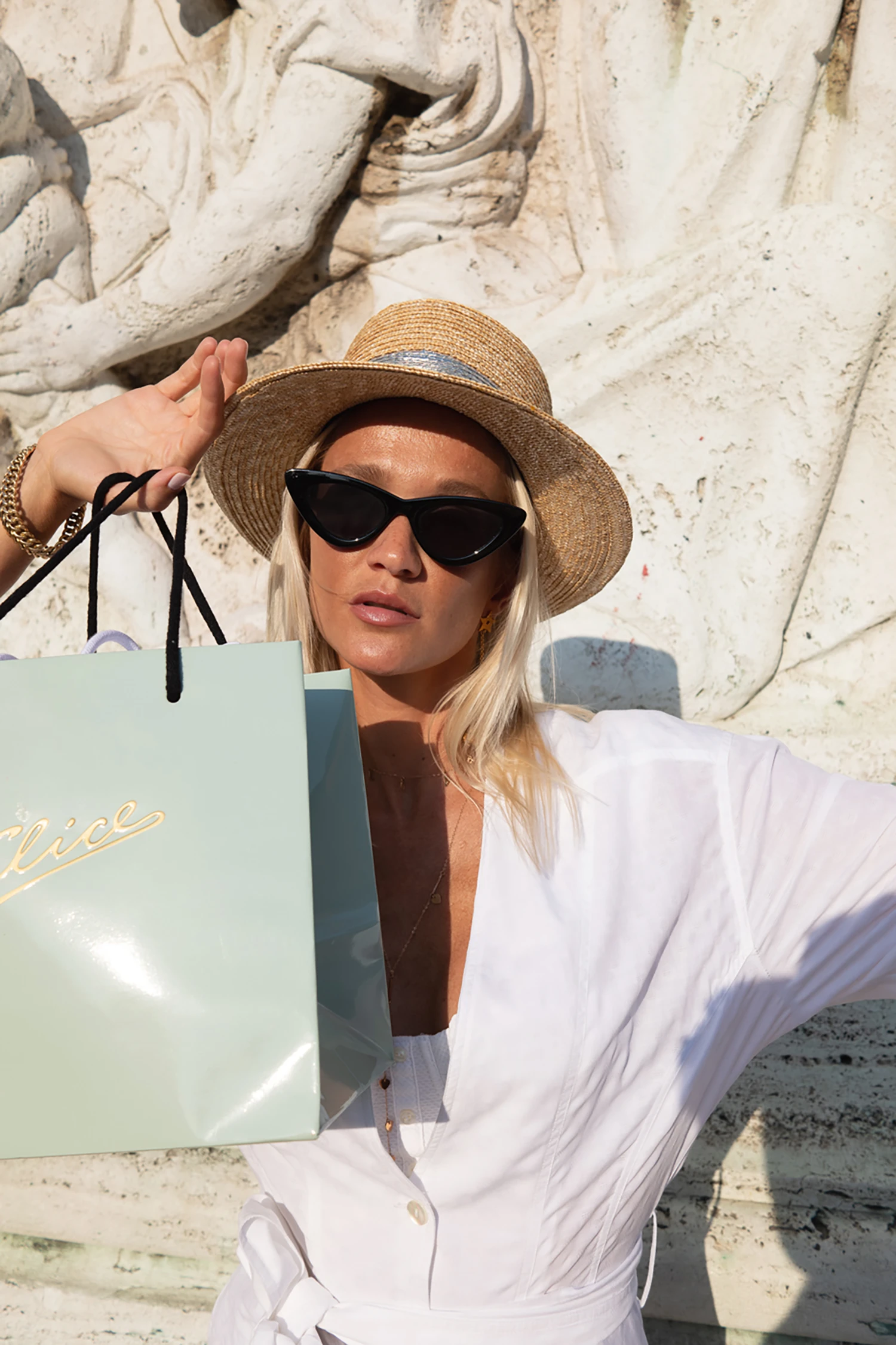
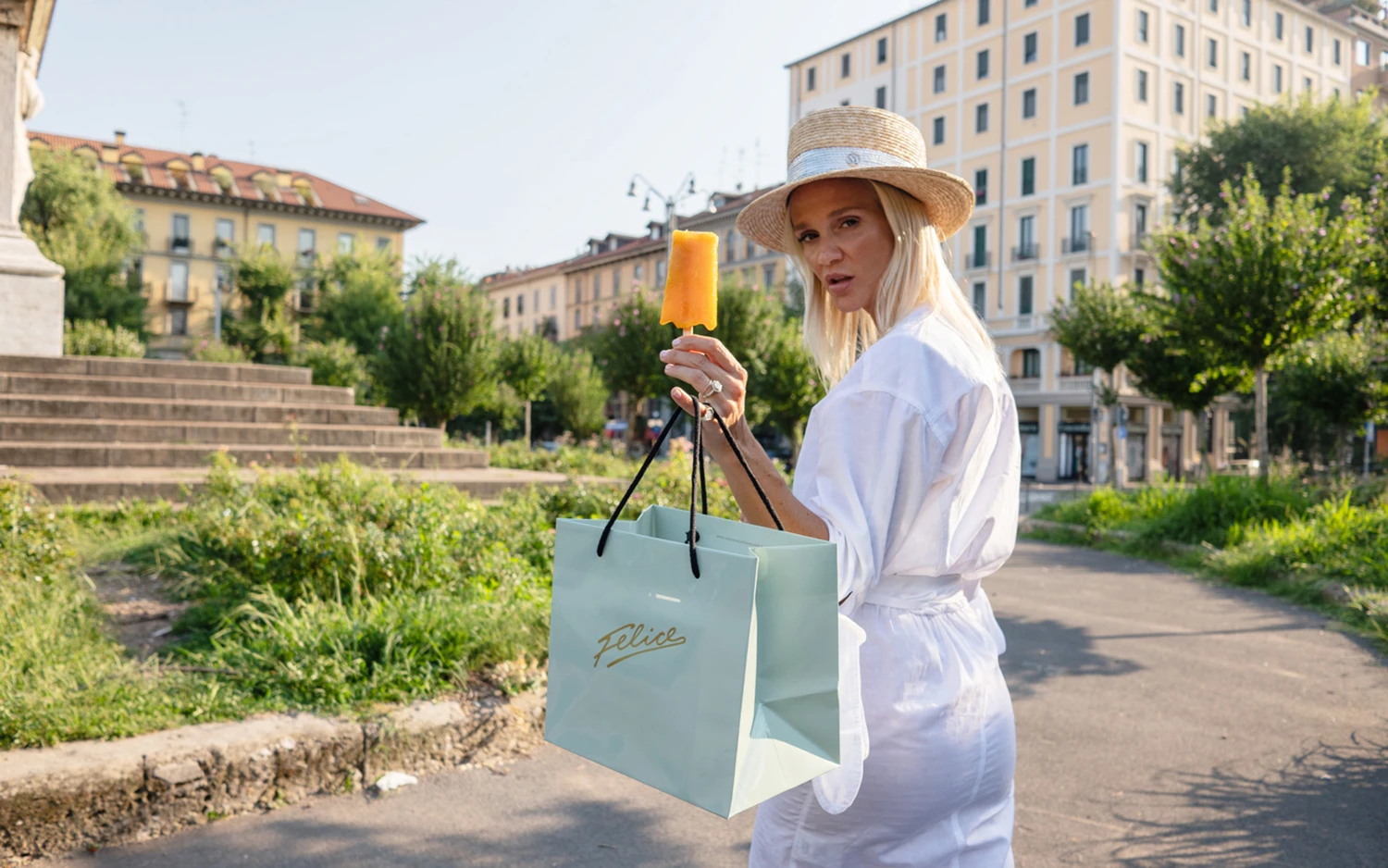
Project Information
Our collaboration started a few years back after working in-house at a luxury design and events agency where i started working on the naming and visual identity for the shop. After returning to freelance i was asked by Felice to continue what i had started in the agency. Needless to say i accepted. Fast forward and i can now happily present some of the projects we've been working on during our collaboration. It has been an amazing journey see them grow into one of the city's most popular ice cream shops.
Starting from the hand-written signature logo I created a brand identity and concept around the shop that would help them stand out, attract and grow into one of Milan's top "gelaterie". The scope of work included the creation of their visual identity, packaging, illustration, photography, website layouts, signage, menus and other related in-shop / communication materials. My aim was to create an original and organic identity that nods to Italian excellence, craftsmanship and heritage – mixed a light-hearted cosmopolitan vibe.
The photo-sessions were shot during two hot summer days in Milan during ferragosto. In the first session i followed my beautiful friend Beverley Blanquart as she graciously moved through the city streets around the shop in Piazza Risorgimento. The second shoot took place inside the shop where we set up a small area to shoot the products during open time creating a somewhat challenging but incredibly funny environment to work in where some helpful shop visitors even lent a hand with the props.
The main approach to both of these shootings where inevitably minimal, heavily influenced by the way i normally work as a graphic designer – "less is always more" and whatever's not essential or superfluous is left out. When i shot these images I tried to look at the scenes and objects from a different angle to find subtle patterns, contrasts and harmonies. My aim was to capture and include some of that raw unfiltered mess that is part of life, looking for beauty in the ordinary things that surrounds everyday daily life keeping things as simple and unaltered as possible using only natural light to give it an original and pure look.
Since our collaboration Felice has gained a loyal following and brought joy to their customers that rated them a median score of 4.5 on both Google Reviews and Tripadvisor. They where also awarded the title of "One of the best ice cream shops in Milan" by the magazine La Repubblica. Their collaborations with fashion brands like Philosophy and No More Plastic has produced great social engagement from their customers and the media. If you're in Milan you should do yourself a favour and try out some of their delicious products – Felice's ice cream is pure bliss.
2020
Il Felice Gelato di Milano
Tags
Art Direction
Branding
Illustration
Packaging
Photography
Approached by the ice cream shop Felice I was asked to create their visual identity, packaging and other related in-shop / communication materials. Starting from the hand-written signature logo I created a brand identity and concept around the shop that would help them stand out, attract and grow into one of Milan's top "gelaterie".


The simple yet elegant and playful identity and packaging of Felice is driven by the hand-drawn signature logo that decorates everything from napkins to packaging and the shops signs made in neon lights. The main inspirations of the identity is a mix of contemporary and vintage culture referencing the playful and optimistic graphics that could be seen in Italy's 1950s art and advertising for brands like Campari and Vespa. The color palette is inspired by flowers and ice cream flavours including a soft pastel green, lavender violet, dusty pink and a pale summer lemon contrasted with a muted gold giving it a classic and elegant look.

The packaging was printed locally using eco-friendly paper-stocks. The logo is set in a muted gold metallic Pantone that was then embossed on the bags giving it a premium and tactile feel reflecting the brands high quality products and attention to detail. The aim was to create something that both looked great and wouldn't get thrown away instantly, but could be reused by their customers thus helping the environment and giving the shop additional visibility at the same time.
Website Layouts
The website layout and clean structure help highlight products and photography giving it an editorial look and feel.

Editorial Photography
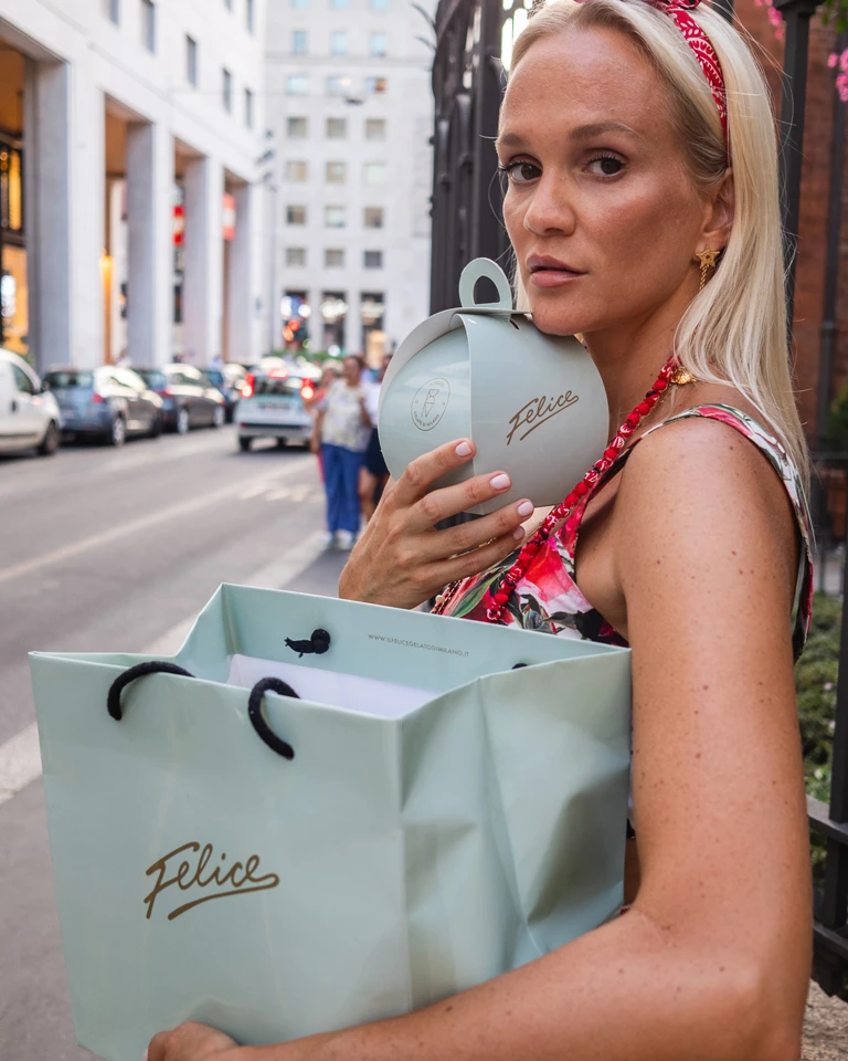
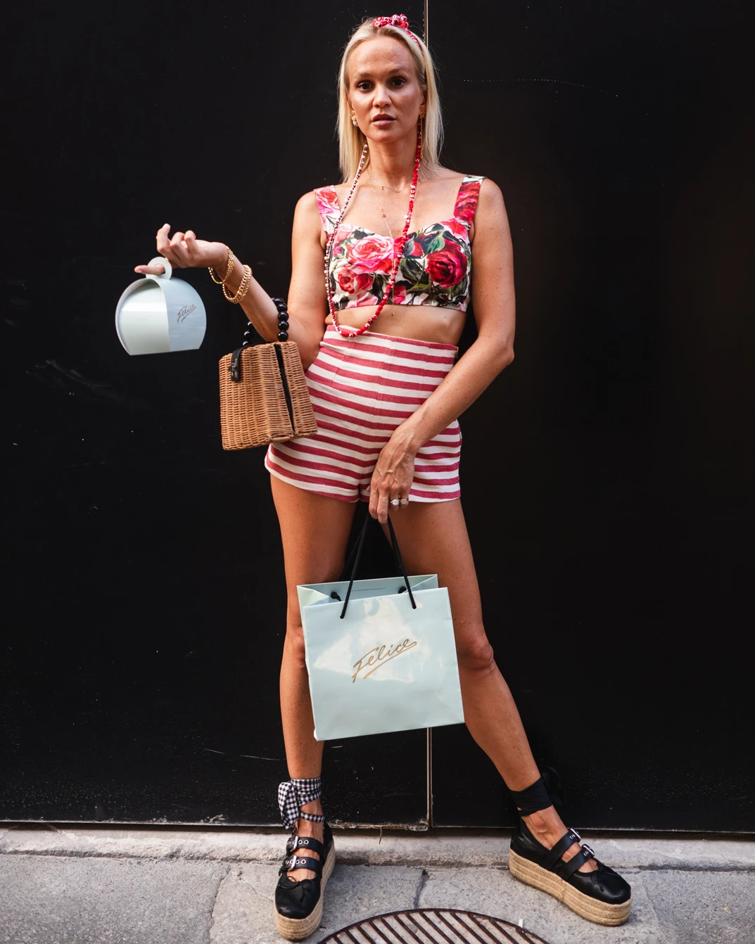
I followed along with my camera on the hot summer streets of Milan as Beverley moved graciously through the city around the shop in Piazza Risorgimento – finishing off with an afternoon aperitivo in the fashionable street of via Montenapoleone.

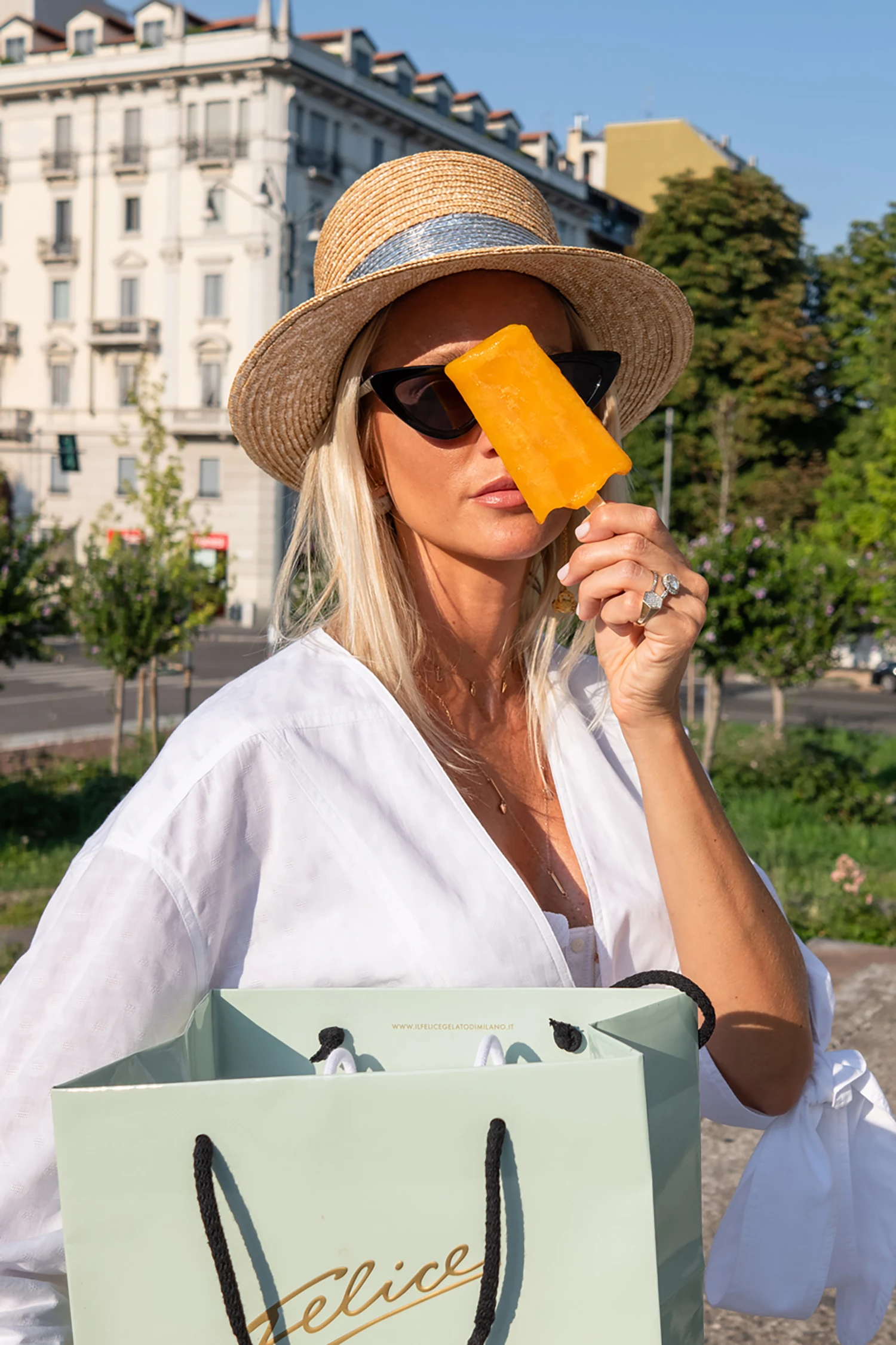
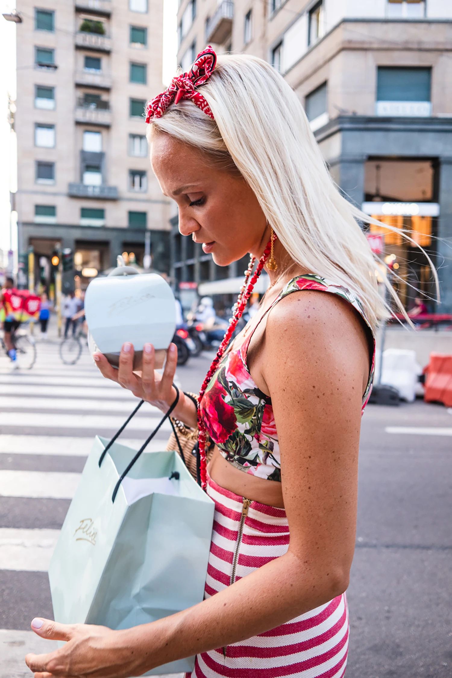
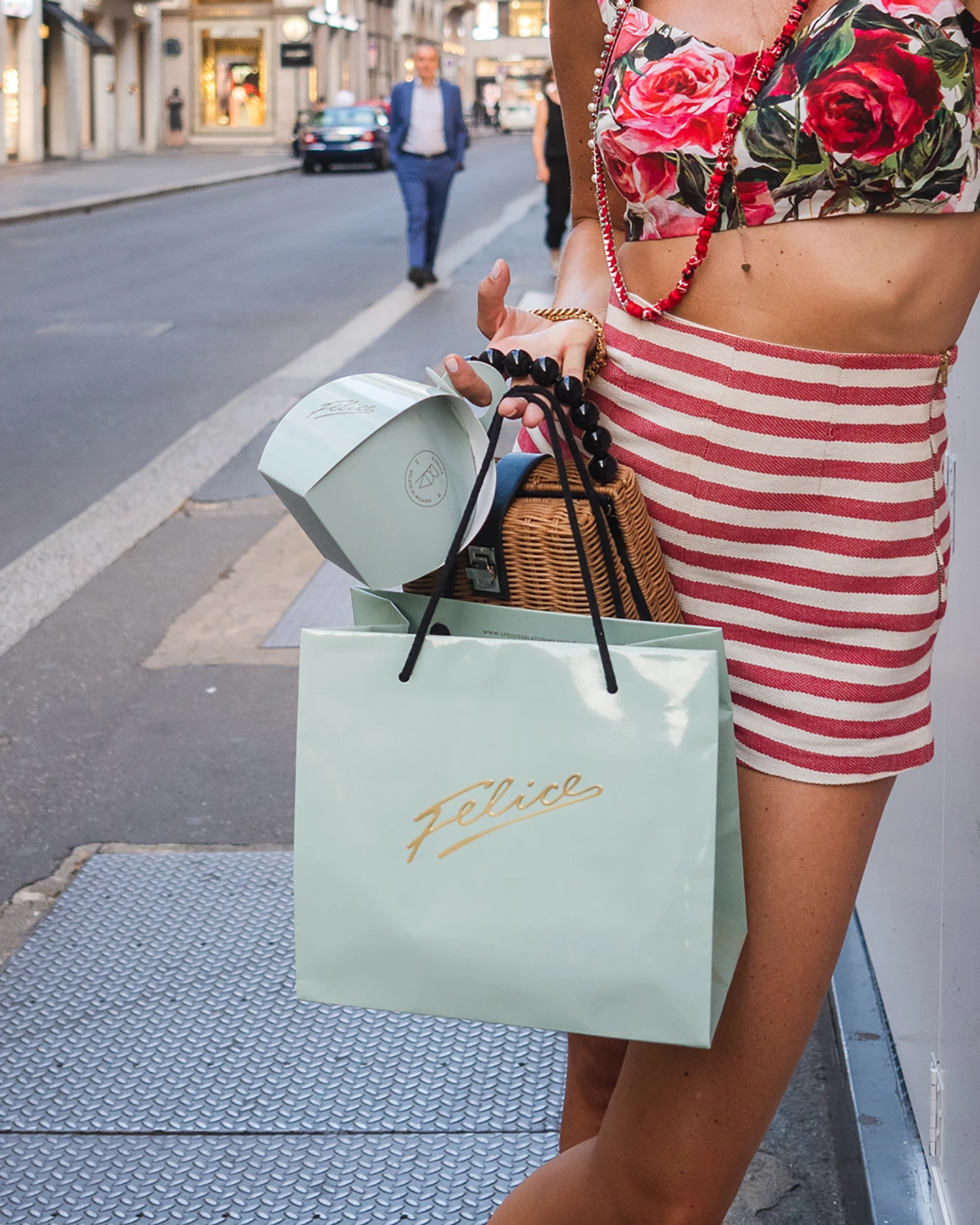
Taking a walk with Beverley in the streets of Milan.
Around noon we reached 37° – As our ice creams melt under the gazing ferragosto sun we headed back to the shop for a refresher and clean up – it was so hot the asphalt under our feet felt like a soft and mushy rubber carpet.

Food Photography
These photos where shot inside the shop using daylight to create a soft, fresh and a natural look.


Project Information
Our collaboration started a few years back after working in-house at a luxury design and events agency where i started working on the naming and visual identity for the shop. After returning to freelance i was asked by Felice to continue what i had started in the agency. Needless to say i accepted. Fast forward and i can now happily present some of the projects we've been working on during our collaboration. It has been an amazing journey see them grow into one of the city's most popular ice cream shops.
Starting from the hand-written signature logo I created a brand identity and concept around the shop that would help them stand out, attract and grow into one of Milan's top "gelaterie". The scope of work included the creation of their visual identity, packaging, illustration, photography, website layouts, signage, menus and other related in-shop / communication materials. My aim was to create an original and organic identity that nods to Italian excellence, craftsmanship and heritage – mixed a light-hearted cosmopolitan vibe.
The photo-sessions were shot during two hot summer days in Milan during ferragosto. In the first session i followed my beautiful friend Beverley Blanquart as she graciously moved through the city streets around the shop in Piazza Risorgimento. The second shoot took place inside the shop where we set up a small area to shoot the products during open time creating a somewhat challenging but incredibly funny environment to work in where some helpful shop visitors even lent a hand with the props.
The main approach to both of these shootings where inevitably minimal, heavily influenced by the way i normally work as a graphic designer – "less is always more" and whatever's not essential or superfluous is left out. When i shot these images I tried to look at the scenes and objects from a different angle to find subtle patterns, contrasts and harmonies. My aim was to capture and include some of that raw unfiltered mess that is part of life, looking for beauty in the ordinary things that surrounds everyday daily life keeping things as simple and unaltered as possible using only natural light to give it an original and pure look.
Since our collaboration Felice has gained a loyal following and brought joy to their customers that rated them a median score of 4.5 on both Google Reviews and Tripadvisor. They where also awarded the title of "One of the best ice cream shops in Milan" by the magazine La Repubblica. Their collaborations with fashion brands like Philosophy and No More Plastic has produced great social engagement from their customers and the media. If you're in Milan you should do yourself a favour and try out some of their delicious products – Felice's ice cream is pure bliss.
Related Projects