2017
Ernest Airlines
Tags
Art Direction
Branding
Illustration
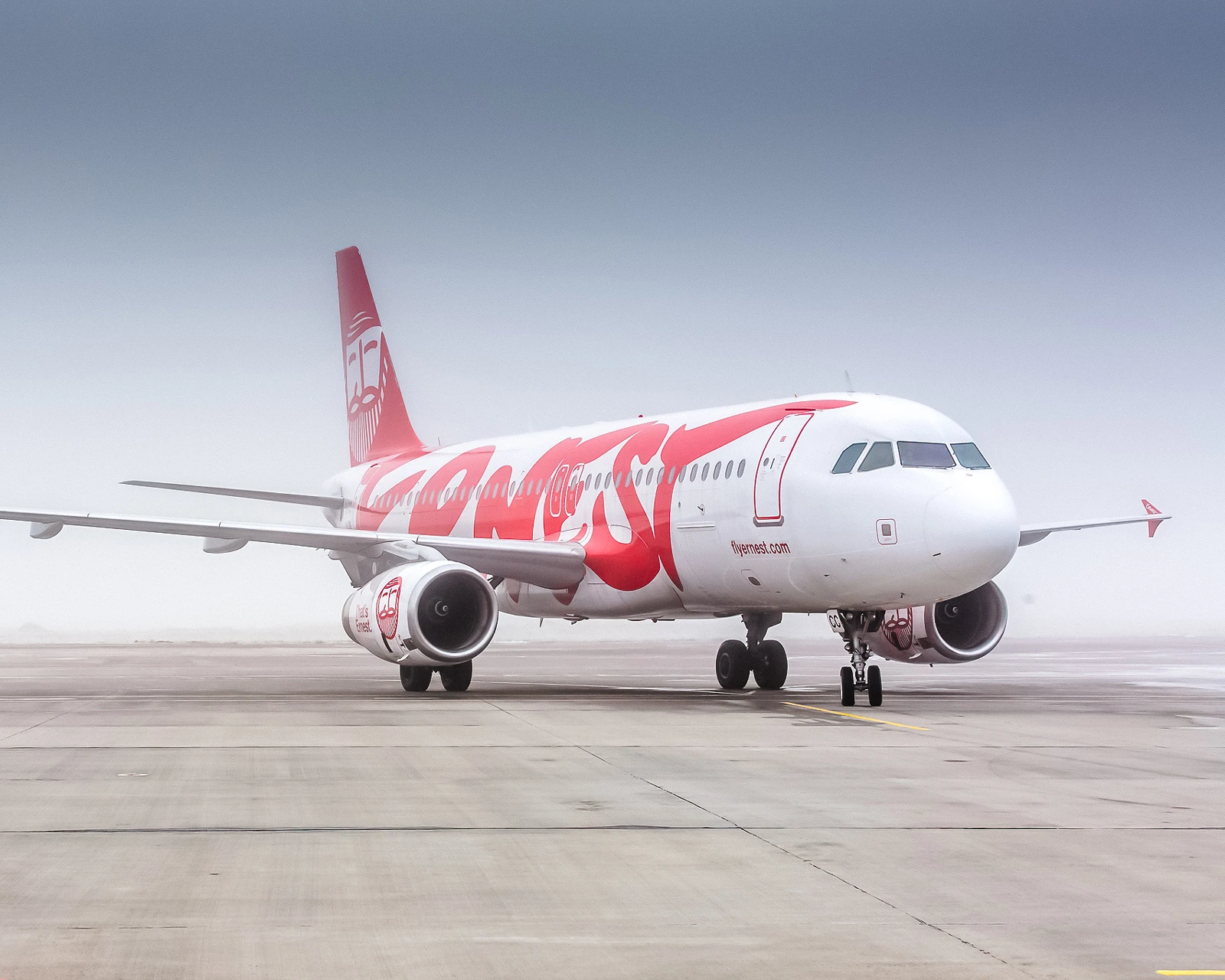
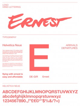
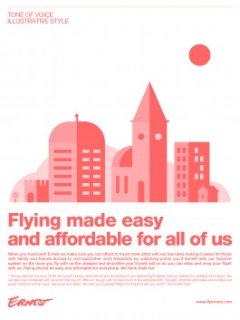
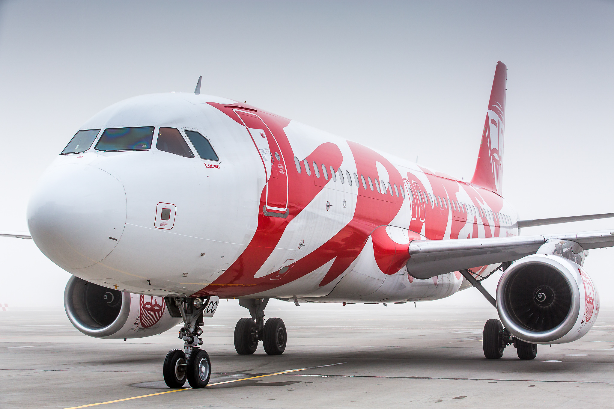
Identity for Fly Ernest based in Milan offering affordable flights between Italy and Albania. Briefed to produce an identity that felt personal, warm and stood out from competitors my aim was to give it a human touch using the signature i drew by hand as well as a set of type, illustrations, colors and guidelines allowing them to work on a larger international scale. Behind the signature we envisioned an experienced, well-traveled, kind and grandfatherly personality resonating with the values the airline wished to communicate in a very down-to-earth and personal way we call “folklig“ in Swedish.
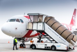
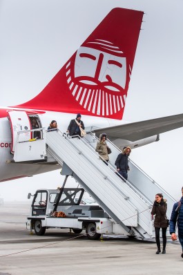
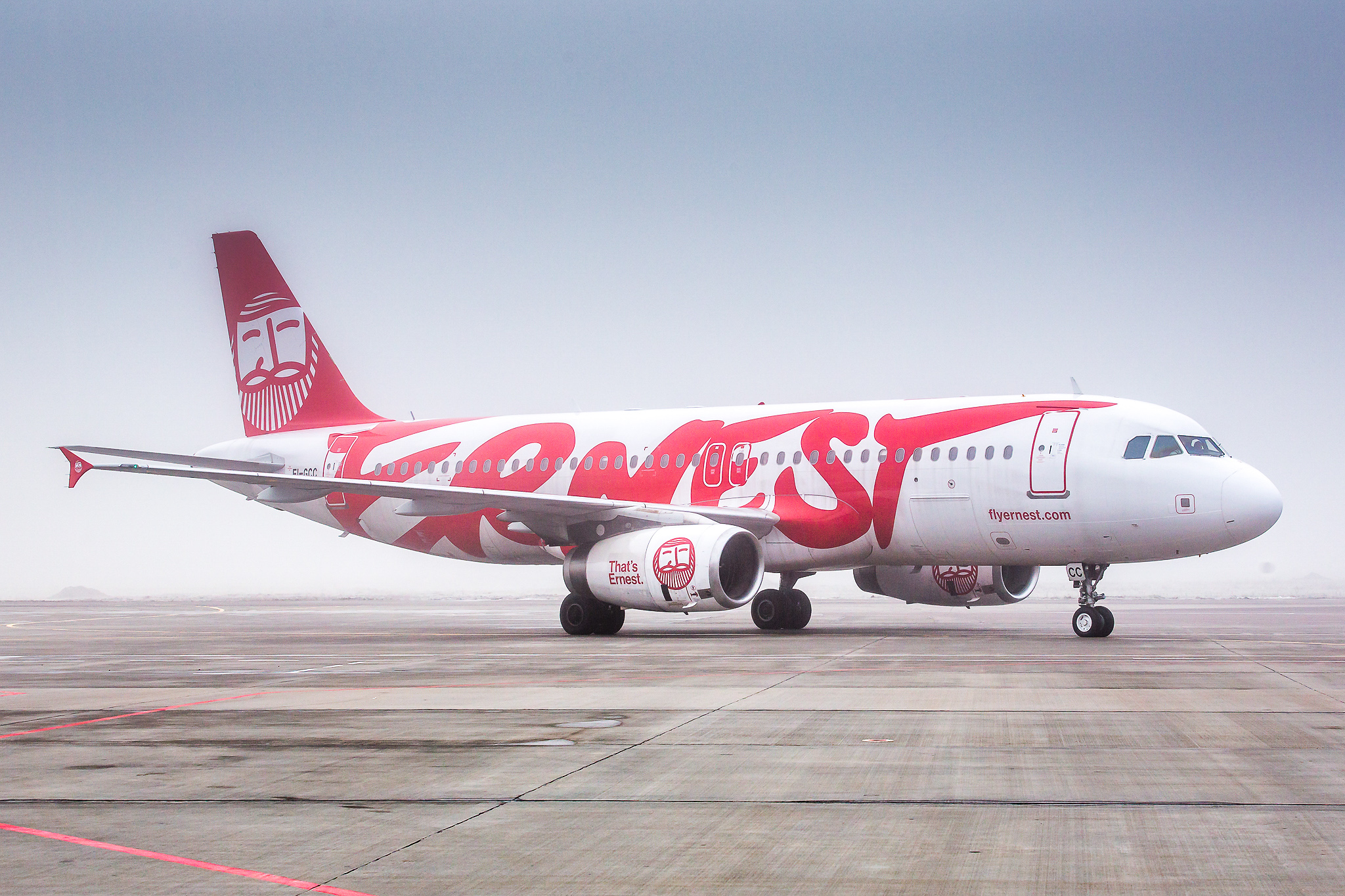
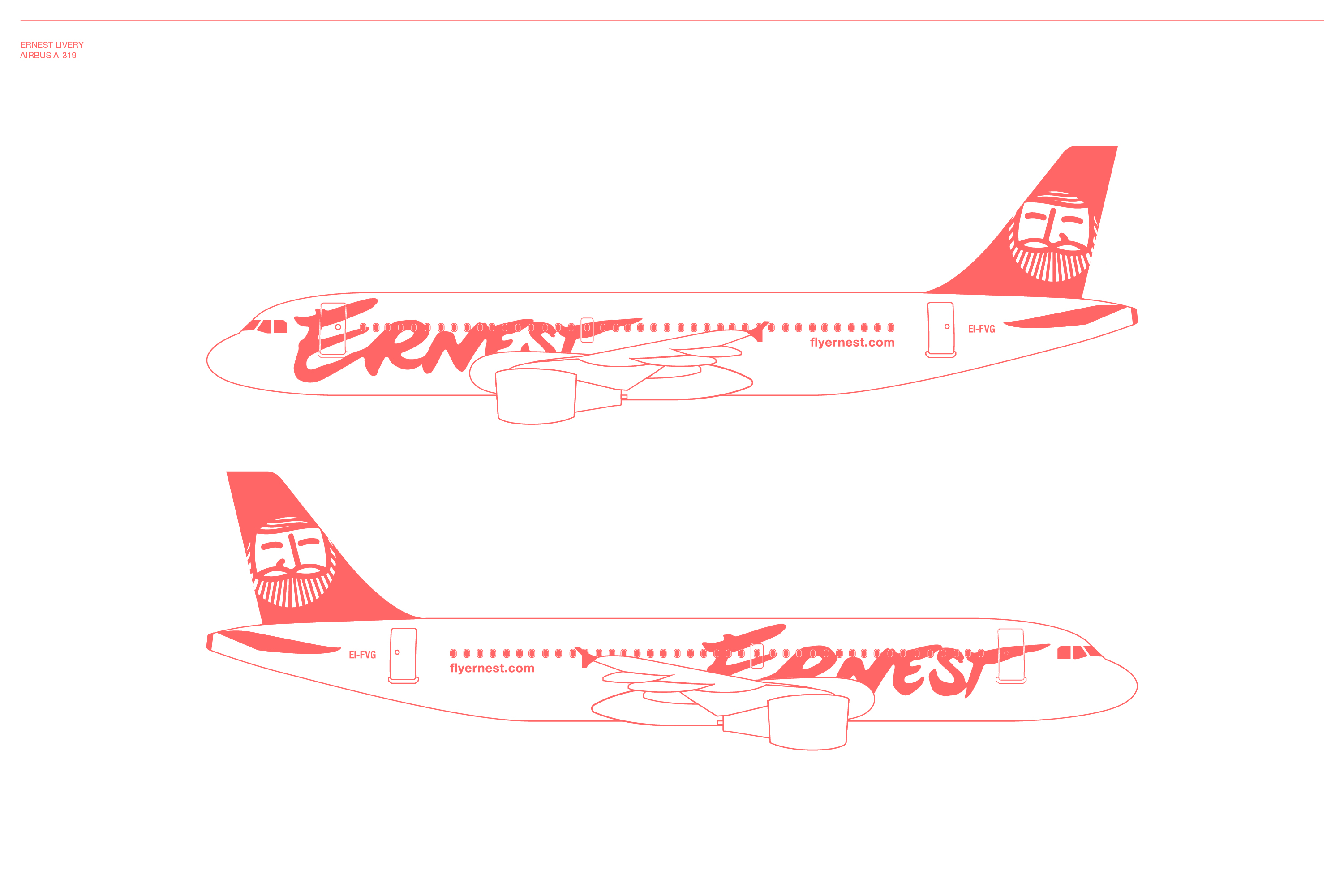
Pristine white and pure red, a bold identity for a bold company. The large logo covers about 80% of the plane making it impossible no to notice. Apart from the logo the planes are also decorated with the icon of Mr Ernest and messages like Ciao that can be found underneath it's belly.
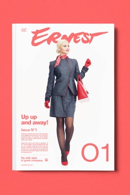
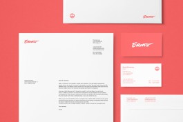
Magazine layout and stationary materials.
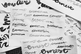
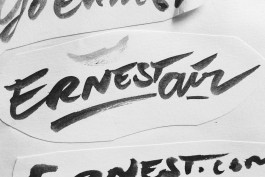
Early drawings and proposals where made with ink and brushes – During the initial phase of the design process i went through multiple variations, versions and names before we finally agreed that Ernest was the most personal and characteristic choice.
The idea was to rethink the whole concept of what an airplane could be and how to make it more humane and communicative. Living near the Linate airport of Milan i have many times i've looked up to the sky and seen the Ernest planes passing by with the message "Ciao" looking down at me, so many actually that even my daughter at 4 years old continued to spot them regularly in the sky – not many companies have been able to do that before if any.
Additional Info
Daniel Annbjer – Branding, Lettering, Illustration and Art direction
Steve McCrumb – Ernest Icon
Vladyslav Gasianets – Airbus Photography
A big thanks goes out to David Girhammar & Co for making this project possible.
2017
Ernest Airlines
Tags
Art Direction
Branding
Illustration
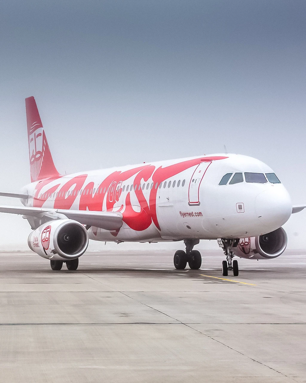
Identity for Fly Ernest based in Milan offering affordable flights between Italy and Albania. Briefed to produce an identity that felt personal, warm and stood out from competitors my aim was to give it a human touch using the signature i drew by hand as well as a set of type, illustrations, colors and guidelines allowing them to work on a larger international scale. Behind the signature we envisioned an experienced, well-traveled, kind and grandfatherly personality resonating with the values the airline wished to communicate in a very down-to-earth and personal way we call “folklig“ in Swedish.


Pristine white and pure red, a bold identity for a bold company. The large logo covers about 80% of the plane making it impossible no to notice. Apart from the logo the planes are also decorated with the icon of Mr Ernest and messages like Ciao that can be found underneath it's belly.


Magazine layout and stationary materials.
The idea was to rethink the whole concept of what an airplane could be and how to make it more humane and communicative. Living near the Linate airport of Milan i have many times i've looked up to the sky and seen the Ernest planes passing by with the message "Ciao" looking down at me, so many actually that even my daughter at 4 years old continued to spot them regularly in the sky – not many companies have been able to do that before if any.


Early drawings and proposals where made with ink and brushes – During the initial phase of the design process i went through multiple variations, versions and names before we finally agreed that Ernest was the most personal and characteristic choice.

Daniel Annbjer – Branding, Lettering, Illustration and Art direction
Steve McCrumb – Ernest Icon
Vladyslav Gasianets – Airbus Photography
A big thanks goes out to David Girhammar & Co for making this project possible.
Related Projects