2017
Thomas Mason
Tags
Art Direction
Branding
Packaging
Web Design
Thomas Mason is an Italian menswear brand by Albini Group producing some of the worlds finest garments. Stylistically the brand is rooted in British heritage and aimed for the modern gentleman with a slight eccentric twist. I was asked to refresh the brand Identity and give them a modernised image and concept as a springboard for what would become their new revisioned brand. My goal was to maintain the brands cultural heritage while updating the brands essential parts to help them adapt and stand out on an international level. The scope of work included ideation, research, concepts and the creation of their main assets including the logo, color palette, patterns, website layout, look-books, sample and fabric books, labels, illustrations, invites and stationary materials.
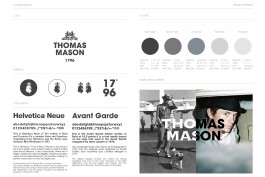
The logo was recomposed to better fit today's applications.
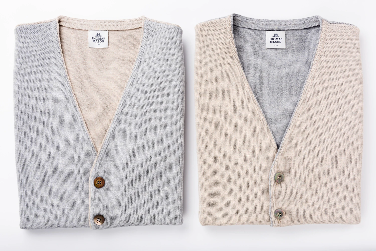
The main color theme of the new identity is toned down in a sober, natural and masculine palette.
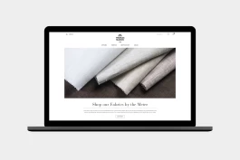
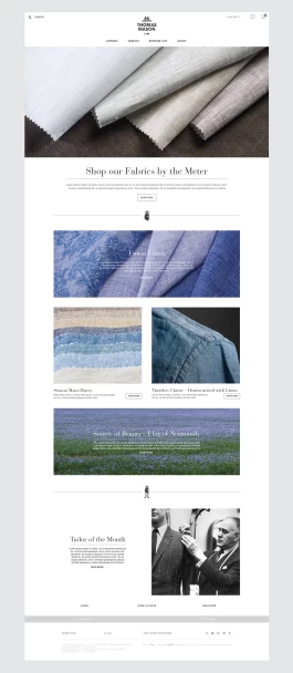
The website layouts follow a more human, spacious and editorial direction placing the people who make and wear the clothes in the front row.
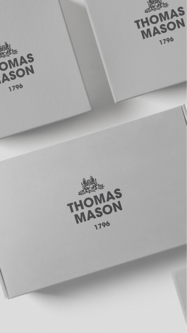
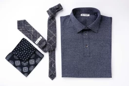
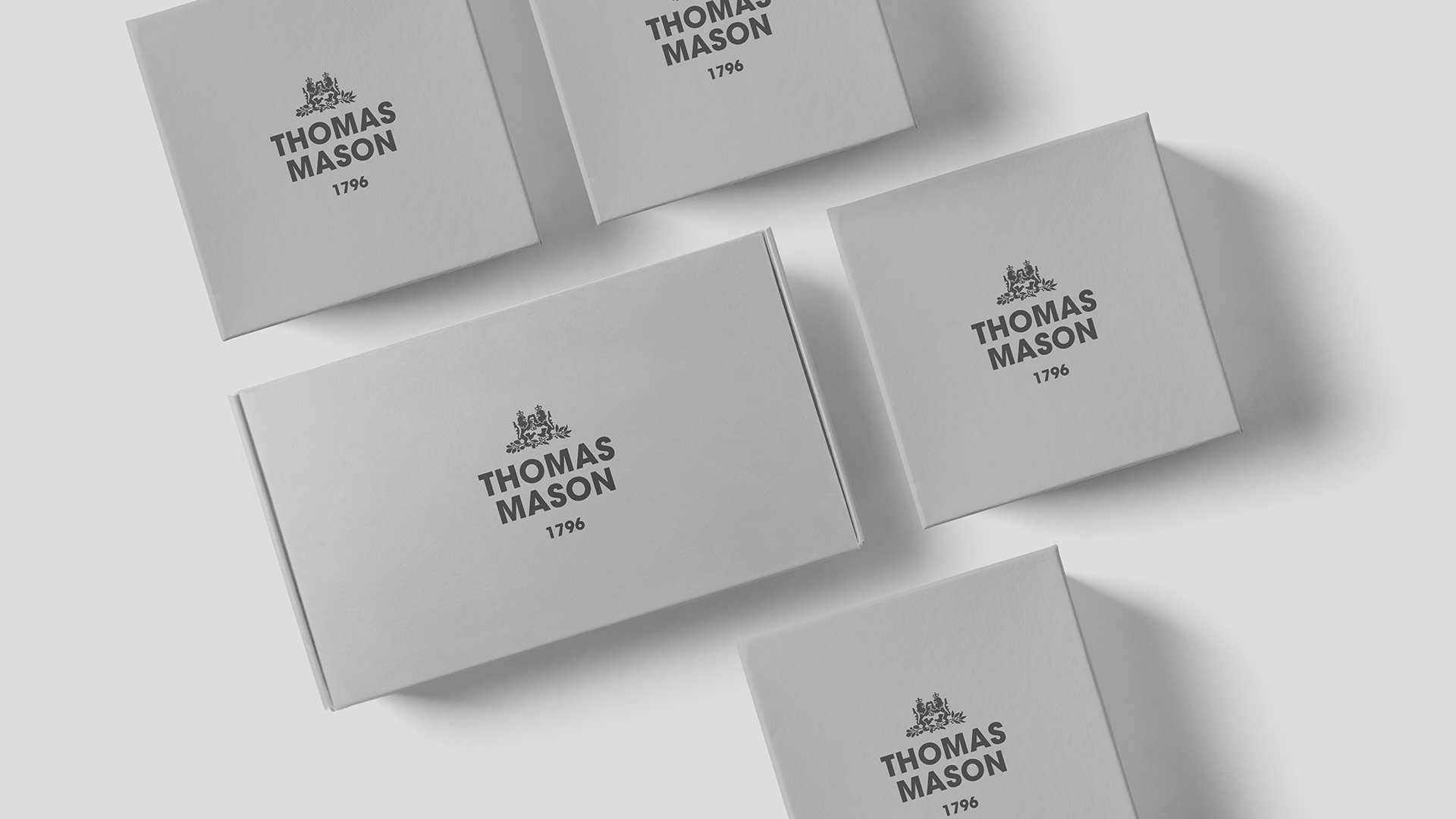
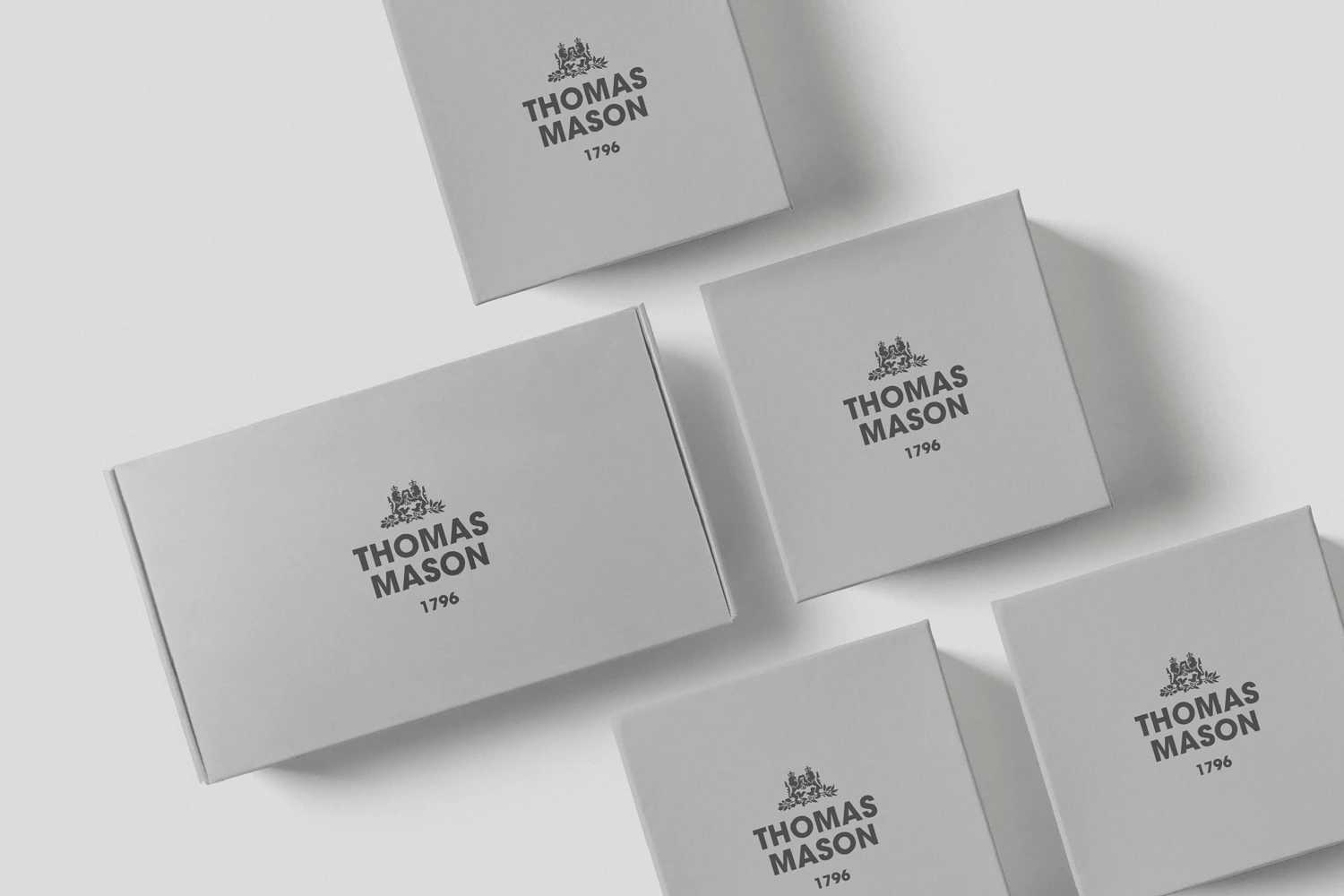
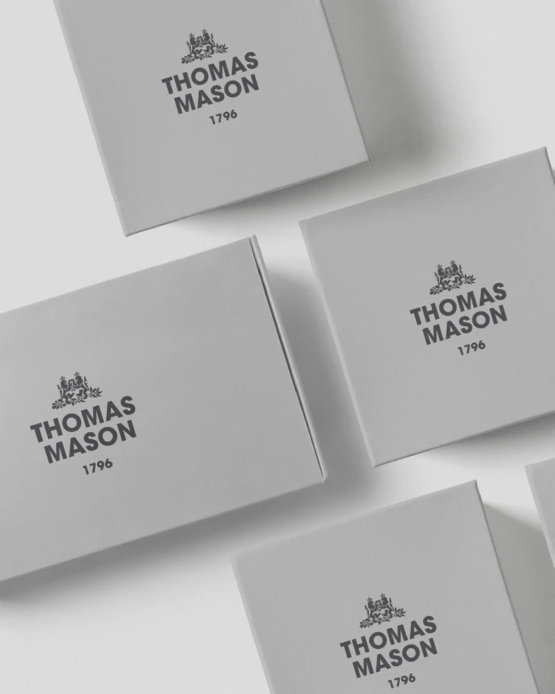
The packaging was tidied up and toned down giving it a modern and timeless look while still maintaining a premium feel with the embossed slightly glossy logo in contrast to the opaque and natural touch of the smart and eco-friendly packaging.
Project Info
I was asked by the Albini Group to create the new identity of their brand Thomas Mason after meeting them for some interesting conversations on the topics of what direction I thought the brand should be moving and how it could reinvent itself in order to adapt to a broader international market.
I developed a concept envisioning a bridge between what the brand had achieved in the past and the possibilities of what it could become in the future. The concept allowed them to channel it's rich heritage and streamline it into a more casual and contemporary philosophy in order to adapt and optimise its new essence in a rapidly changing world. During our collaboration I was invited to meet the good people from the Albini group division that I work closely with during the following year. After the new concept and brand identity had been established I continued the task of redesigning their stationary materials, packaging and other communication tools. I also created conceptual designs helping them to independently maintain consistency.
In the early stages of their new brand identity I was invited to visit them in their booth over at the Pitti show in Florence (which i had also made invites and a look-book for). Seeing the positive feedback from their clients in first person was a priceless memory and stimulus to continue helping brands grow into and fulfil their potential no matter size or history – It was probably there all along and all I had to do was poke around a bit and give them a bit of an encouraging push in the right direction.
Thomas Mason has since our collaboration grown from an already established player into an updated even more confident, timeless and future proof version of itself!
Visit their website here
2017
Thomas Mason
Tags
Art Direction
Branding
Packaging
Web Design
Thomas Mason is an Italian menswear brand by Albini Group producing some of the worlds finest garments. Stylistically the brand is rooted in British heritage and aimed for the modern gentleman with a slight eccentric twist. I was asked to refresh the brand Identity and give them a modernised image and concept as a springboard for what would become their new revisioned brand. My goal was to maintain the brands cultural heritage while updating the brands essential parts to help them adapt and stand out on an international level. The scope of work included ideation, research, concepts and the creation of their main assets including the logo, color palette, patterns, website layout, look-books, sample and fabric books, labels, illustrations, invites and stationary materials.


The logo was recomposed to better fit today's applications.
The main color theme of the new identity is toned down in a sober, natural and masculine palette.


The website layouts follow a more human, spacious and editorial direction placing the people who make and wear the clothes in the front row.


The packaging was tidied up and toned down giving it a modern and timeless look while still maintaining a premium feel with the embossed slightly glossy logo in contrast to the opaque and natural touch of the smart and eco-friendly packaging.


I was asked by the Albini Group to create the new identity of their brand Thomas Mason after meeting them for some interesting conversations on the topics of what direction I thought the brand should be moving and how it could reinvent itself in order to adapt to a broader international market.
I developed a concept envisioning a bridge between what the brand had achieved in the past and the possibilities of what it could become in the future. The concept allowed them to channel it's rich heritage and streamline it into a more casual and contemporary philosophy in order to adapt and optimise its new essence in a rapidly changing world. During our collaboration I was invited to meet the good people from the Albini group division that I work closely with during the following year. After the new concept and brand identity had been established I continued the task of redesigning their stationary materials, packaging and other communication tools. I also created conceptual designs helping them to independently maintain consistency.
In the early stages of their new brand identity I was invited to visit them in their booth over at the Pitti show in Florence (which i had also made invites and a look-book for). Seeing the positive feedback from their clients in first person was a priceless memory and stimulus to continue helping brands grow into and fulfil their potential no matter size or history – It was probably there all along and all I had to do was poke around a bit and give them a bit of an encouraging push in the right direction.
Thomas Mason has since our collaboration grown from an already established player into an updated even more confident, timeless and future proof version of itself!
Visit their website here
Related Projects